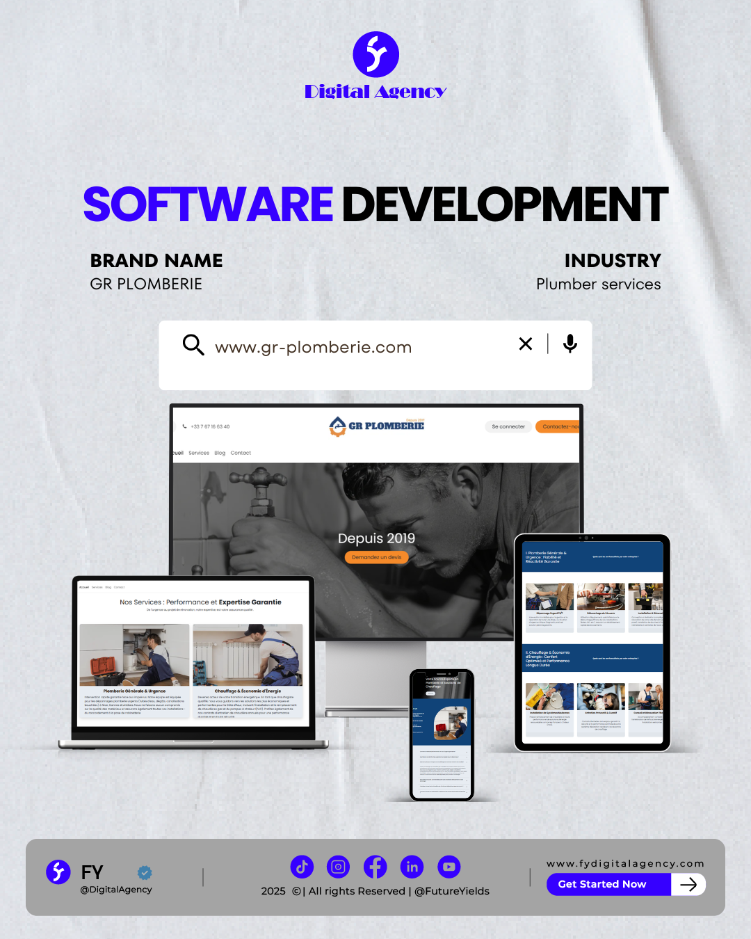
We focused on a Mobile-First Development approach, recognizing that a majority of their traffic comes from users in urgent need of assistance. By utilizing a high-contrast professional palette (Navy, White, and Safety Orange), we established immediate visual trust. We engineered a streamlined navigation system that separates “Emergency Repairs” from “Long-term Projects,” ensuring that users reach the right information with zero friction. Every design choice was made to highlight their “Expertise & Performance” value proposition.