Case Study Details

Engineering a Bold Identity for the Modern Service Sector

Industrial Branding & Strategic Visual DNA

The Challenge

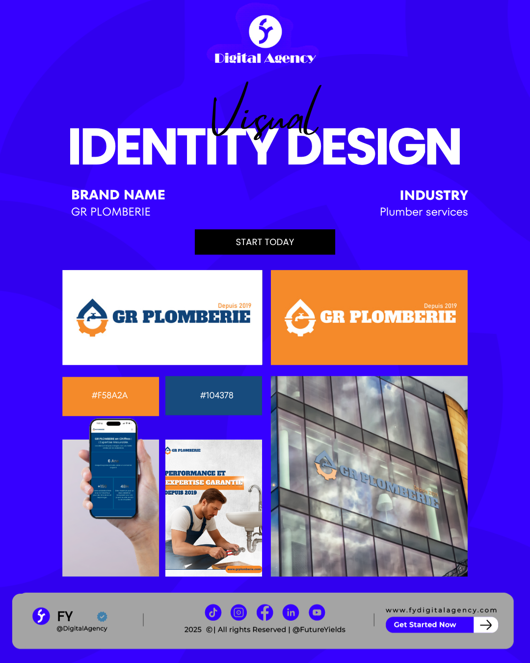
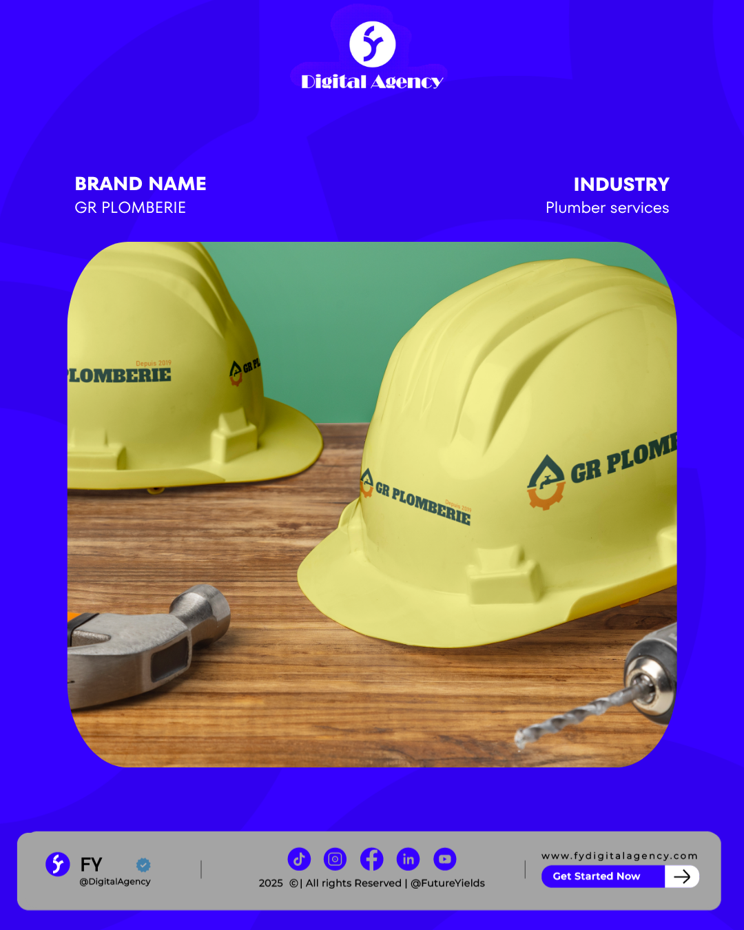
In the home service industry, most companies suffer from generic, dated branding. GR Plomberie, a French plumbing agency, needed to break this cycle. The challenge was to create a visual identity that communicated Technical Mastery, Reliability, and Professionalism. They needed a brand that looked as credible on a luxury renovation site as it did during an emergency repair call.

Our Strategy

FY developed a “Structural Mark” that balances industrial strength with modern cleanliness. Our approach included:

  • Symbolic Fusion: Designing a custom icon that merges a water droplet with a mechanical gear, instantly communicating the “fluid” nature of plumbing and the “precision” of engineering.
  • High-Contrast Palette: Using a bold Blue (#104378) for trust and authority, paired with a vibrant Safety Orange (#F58A2A) for high visibility and energy—essential for service vehicles and uniforms.
  • Authority Typography: Selecting a thick, slab-serif font that projects durability and established expertise (“Depuis 2019”).
  • Multi-Platform Design: Optimizing the logo for maximum impact on digital screens, smartphone apps, and large-scale physical signage (as seen in the building mockup).

The Outcome

The new GR Plomberie identity successfully positioned the agency as a premium leader in the French market. By professionalizing their “Visual DNA,” we helped them gain instant trust from high-end clients and property managers. The brand now conveys a message of “Guaranteed Performance and Expertise,” allowing the client to stand out as a modern authority in a traditional field.

Related Projects

Strategies enable brands to unlock revenue.