Case Study Details

Packaging the Future: A Solid Identity for BK Trading

Brand Identity & Industrial Visual Systems

The Challenge

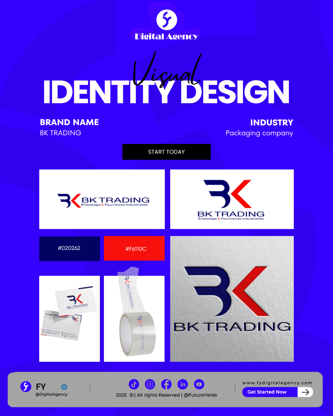
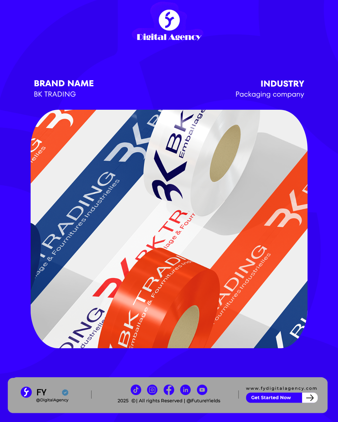
BK Trading, a specialist in the packaging sector, needed an identity that felt as sturdy and reliable as the products they provide. In the logistics and supply chain world, a “weak” logo can make a company look unprofessional. They needed a visual mark that could stand alongside global shipping giants while remaining distinct and memorable.

Our Strategy

FY engineered a “Structural Branding” system. We designed a logo that focuses on geometry and precision—evoking the ideas of containment, protection, and efficiency. The typography was chosen for maximum legibility at any size, and the color palette was selected to project authority and industrial strength. We ensured the brand identity was versatile enough to work on everything from digital invoices to physical cardboard packaging and warehouse signage.

The Outcome

We delivered a robust and professional brand image that instantly elevated BK Trading’s market presence. This new “Visual DNA” provides them with a competitive edge in the B2B sector, communicating to their partners that they are a modern, organized, and high-capacity packaging leader.

Related Projects

Strategies enable brands to unlock revenue.